The logo sits at the heart of the SmartRadio identity. The logo was designed to function as a universal symbol to indicate to consumers which products are fitted with smart radio technology.
The SmartRadio logo should always be used correctly and treated with care; it is the aspect of the brand most likely to feature in all communications.
Logo versions
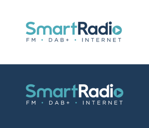
1. Primary Version
The primary version of the SmartRadio logo should be used at all times possible.
2. Alternative Version
The alternative version of the logo should only be used when the logo is displayed at a size where the sub headings are not legible. The alternative version would also be used if the third party rejects the primary version.
Exclusion Zone
Clear space around the logo is important as any other element that could intrude on it, whether text or images, will compromise the integrity of the logo.
The ‘exclusion zone’ is the clear area that surrounds the SmartRadio logo. To ensure that the logo remains clear and has impact, nothing should ever appear inside the exclusion zone.
The exclusion zone is equal to the height of the letters in the logo. This distance is marked as faint ‘S’ symbol on the diagram to the right.
This means using a single ‘S’ height to measure the space above, below and to the left and right of the logo and ensuring no other elements fall within this area. It is worth remembering that this exclusion zone is a minimum distance – in most cases it is best to leave as much space as possible around the logo to ensure its impact and legibility.
Minimum Size
Digital
To ensure legibility the primary logo should never be reproduced smaller than 76px measured across the width.
The alternative version of the logo should never be reproduced smaller than 62px measured across the width
Print
To ensure legibility the primary logo should never be reproduced smaller than 27mm measured across the width.
The alternative version of the logo should never be reproduced smaller than 15mm measured across the width.
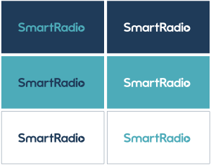
Logo usage
Full colour
This artwork version of the logo should be used whenever the logo needs to be reproduced for promotional materials and third party packaging. The logo should appear on a white/off white background wherever possible. If not, the reverse logo must be used and placed upon a solid background colour.
Greyscale
On all mono communications and materials when the logo needs to stand out on a light coloured background, the black version of the logo should be used.
Reverse
On all communications and materials when the logo needs to stand out on a dark coloured background, the reverse version of the logo should be used.