An introduction to Science Group

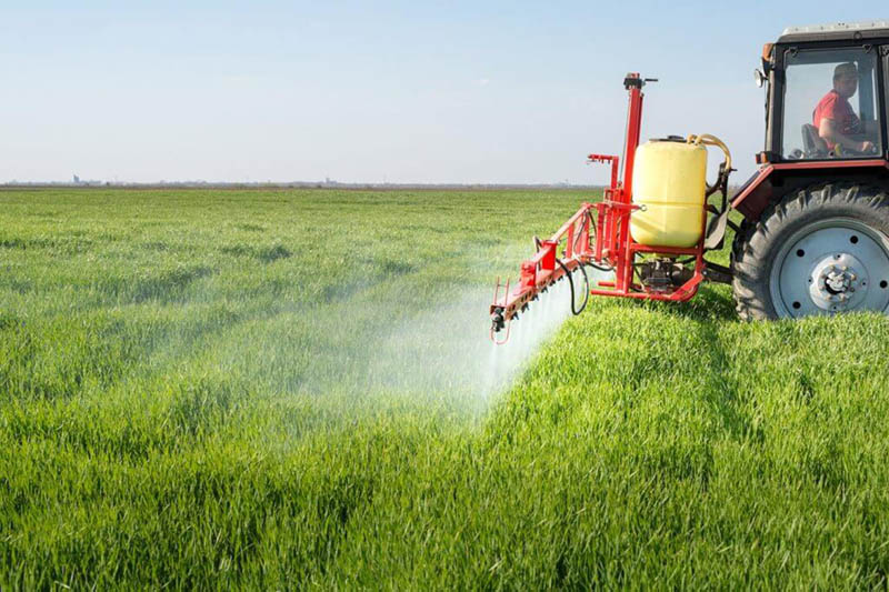
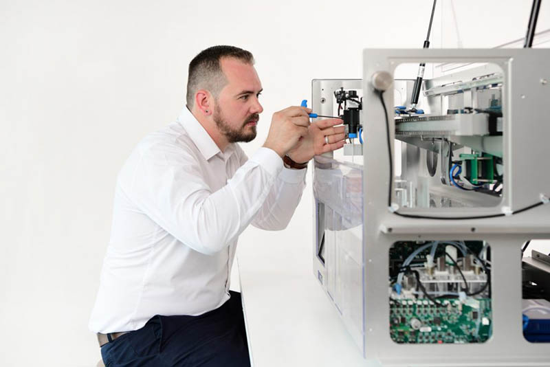
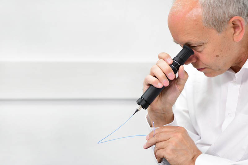
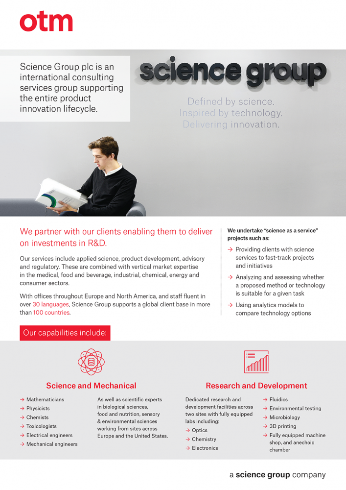
Science Group plc (AIM:SAG) is an international consulting services group supporting the product innovation lifecycle to enable our clients to deliver on their investments in R&D. Our services fall into four broad categories: Applied Science, Product Development, Technology Advisory and Regulatory. These services are combined with vertical market expertise in Medical, Food & Beverage, Industrial, Chemical, Energy and Consumer sectors. With offices throughout Europe, North America and China/Hong Kong and with over 30 languages written and spoken, Science Group supports a global client base.

Brand Guardian
Melissa Shone Brand Guardian Email Melissa Shone

The Brand

Science Group’s proposition

  • Science and technology: World-class expertise, underpinning everything we do
  • Closer client relationships: Active collaboration, building deeper understanding
  • Clear commercial benefit: Outcome focus, delivering tangible value for every client

Science Group’s clients know us for…

  • Our expertise, providing world-class capabilities in science and technology
  • Our collaborative way of working closely with their teams to really understand their needs
  • Our effectiveness, delivering timely solutions that make a real commercial impact

Science Group’s brand is…

  • Clear

  • Engaging

  • Impactful

Colour Palette

Primary Colour Palette

As a general rule, each operating company has a single colour which sits at the core of any design, with grey or a lighter variarion of the core colour as a secondary colour.

In PowerPoint we have built in a broader colour palette to provide more choice for graphics and charts. However these should not be used elsewhere.

We have a colour hierarchy for usage, please refer to the colour palette PDF in the download box for further instruction.

Screen

Principle Black R0 G0 B0 #000000
Background Black R243 G243 B243 #f3f3f3
Text Grey R71 G71 B71 #474747
Text White R255 G255 B255 #ffffff

Print

Science Group Black C0 M0 Y0 K100
Science Group Black Pantone® Black
Text Grey C0 M0 Y0 K80
Text Light Grey C0 M0 Y0 K60

Extended palette

Sky Blue #94cdf1 R148 G205 B241
Mid BLue #4d9cc8 R77 G156 B200
Dark Blue #152956 R21 G41 B86
Teal #50aaa5 R80 G170 B165
Mint #89e9c1 R137 G233 B193
Orange #ecaf3e R236 G175 B62

Fonts

Atlas Grotesk

Atlas Grotesk for use in marketing communication materials. Font size and colours are built into the Word and PowerPoint templates, please use this guidance wherever possible.

Arial

Arial for general use (across all applications including Word, Excel, PPT, Outlook, MindManager etc).

Notes

All typography should be set in Title or Sentence case, including headlines across brochures, adverts, PowerPoint and presentations.

Depth of field

This actually refers to a shallow area within the image that is in sharp focus, with other areas out of focus. This gives a contemporary effect with a feeling of space in the image. Type can also be placed over these areas without either looking cramped. Areas like this can also be extended using Photoshop.

Desaturated colour

Controlled colour will give a more sophisticated, higher quality impression. This can mean images that are desaturated slightly, where a more blue/grey spectrum tends to come through. A consistent approach to colour like this will also bring together imagery from a wide range of environments.

White

White is one of the key components of the Science Group visual identity, giving a sense of clarity and calm. Where possible, choose imagery where white is a strong element.

Composition

An unusual angle can be a metaphor for the way that we look at projects. Contrasting a flat area with some slight movement created by a flash blur is a good technique to look for.

Real

To demonstrate our understanding and affinity with the world of our clients, our image choices need to be as real as they can be. Choose images where people are not looking at the camera. They should be working, concentrating, interacting with colleagues.

We should be looking for…

  • Horizontal images are recommended
    Details / Close ups
  • Interesting overviews of sector dynamics
  • Natural lighting
  • Lighter colour images
  • Interesting views of products on lighter backgrounds

Sample Galleries

Iconography

Notes

All icons should be a single outline or a filled colour with no shading and should be in a single colour. Where possible, we should use the same icon to represent a word e.g. Chemistry is a series of 3 glass mixing glasses and that should be used whenever we talk about chemistry.

We have a licence for ‘noun project’ which can be used to download icons or get ideas. If you are getting a series of icons for the same project, it is best to engage a design agency to work on these.

Line weight

Icons used on the same page should all have the same line weight.

Size

Icons should all be the same style and size on a page with the same white space around each one.

Downloads

In Use

Intelligence is simple

This is the core visual principle of all the Science Group companies brands. To achieve this feel in the design approach we use white space, neutral grey colours and a singular solid colour for each brand.

For imagery, we want to achieve images that can complement the visual treatment. Each image we create should reflect our brand attributes: smart, analytical, expert, collaborative and effective.

Main points

  • Lots of natural light
  • Emotive and dynamic
  • Parallel and perpendicular angles
  • Graphic
  • Use of few people
  • Out of focus/in focus of either objects or people
  • Overview shots
  • Detail shots

Print works examples

Final take away

The most important things to remember about the Science Group brand is that it is simple. Less is more, keep everything to a minimum and as much white space as possible. Photography is key. Keep the images uncluttered, with a depth of field and as white as possible.

If you have any further queries or want any specific questions answered, please call the brand guardian.

Brand Guardian
Melissa Shone Brand Guardian Email Melissa Shone