Logotype

Frontier logo

Logo variations

Exclusion zone

Small size usage

Incorrect usage
Our logos
Our masterbrand is Frontier Smart Technologies Group which currently has a single sub brands, Frontier Silicon.
Both use the same symbol, colours and typographic style.
Our symbol is a representation of connections, both between us and our customers and at a microscopic level in our processors.
Our variations
Because the logo is such a recognisable and highly visible brand asset, it is vital that it is always applied consistently wherever it appears. There are two versions of our logo; primary and secondary.
The primary logo should be used wherever possible. A minimum size has been established of 5mm high to be used in exceptional circumstances.
The secondary logo should only be used whenever it is not possible to use the primary logo at large sizes. A minimum height of 10mm has been established to be used in exceptional circumstances.
Black and white versions are only to be used when it is not possible to produce in two colours.
Exclusion zone
The logo is protected by an exclusion zone which ensures that it has maximum impact and visibility across all communications.
The exclusion zone is calculated by the use of the circles from our symbol as illustrated opposite.
Please observe this exclusion rule and ensure that no other graphic elements intrude into the zone.
By keeping this area clear it will ensure that our logo is never camouflaged, compromised or lost on the page.
Small size usage
The smallest usage of our Primary logo is 5mm high. At smaller sizes the text becomes hard to read and the logo starts to fill in.
Our Secondary logo can be used down to 10mm high. This applies to Frontier Smart Technologies Group, and Frontier Silicon.
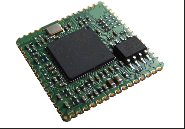
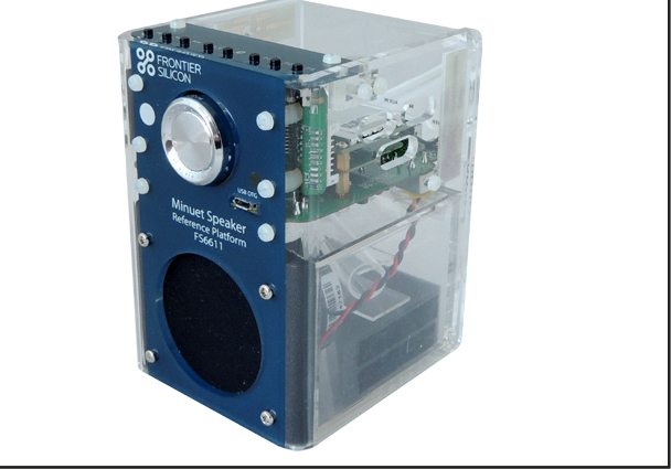
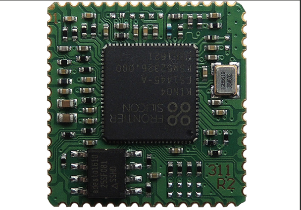
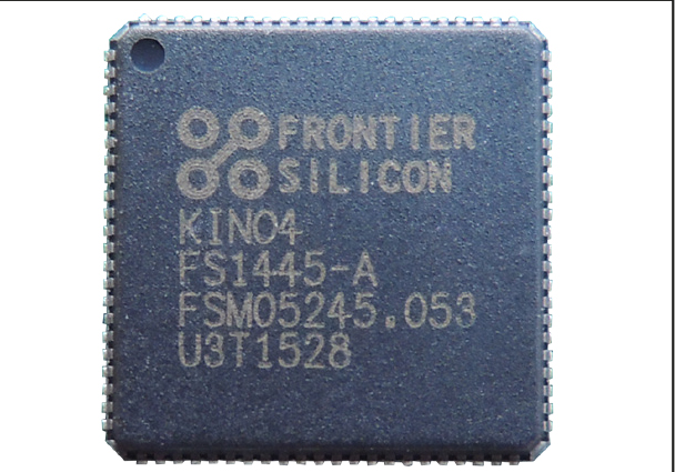
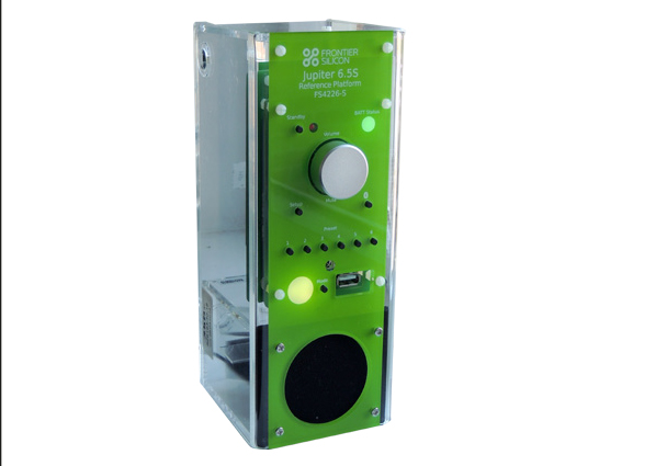
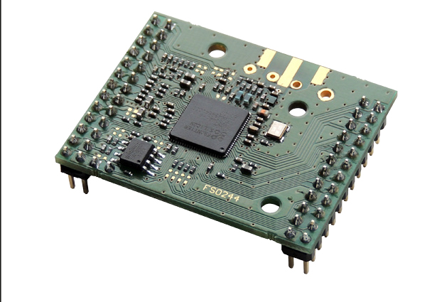
To fit on our smallest processors we have created a version of the Frontier Silicon logo that changes the lockup, uses a slightly thinner version of our symbol and fractionally increases some of the space between letters in the word Silicon. These subtle changes help maximise the size of the symbol and legibility of the typography when used on processors at 10mm wide or less.
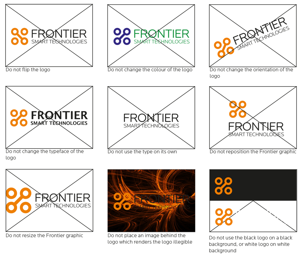
Incorrect use
The Frontier Smart Technologies logo is the most important part of our branding and is therefore very important that it is used correctly. The logo should only be applied in the way that it is supplied and should not be altered in any way. Opposite are some other examples of how not to use the logo.
These principles apply to our full set of logos including Frontier Smart Technologies Group, and Frontier Silicon. They also apply to both the horizontal and vertical versions of our logos.
Colour palette
Black, white and orange should be used whenever possible. When it is necessary to use a greater variety of colours for charts, graphs, highlights or lines, the blacks can be tinted. We use 80%, 50% and 20% tints to clearly define the black tones.
We can also tint our Orange to 80% and 50% for charts and graphs.
Swatches
PANTONE 165
#ed7f00
PANTONE 165
238R 127G 0B
C 0 M 60 Y 100 K 0
BLACK
K 100
#000
WHITE
R 0 G 0 B 0
Tints
PANTONE 165 80%
PANTONE 165 80%
PANTONE 165 50%
PANTONE 165 50%
80% BLACK
PANTONE COOL GREY 11
50% BLACK
50% BLACK PANTONE COOL GREY 9
20% BLACK
20% BLACK PANTONE COOL GREY 7
Ratios
Our brand colour palette is mainly black and white with small highlights of orange to add ownability and colour to our communications.
The orange should always be a small detail and never used in large quantities such as for a background colour.
Black is mainly used for covers and divider pages, while white is used within communications.
It is important that our colours are produced accurately across all communications.

Font
Typography
Locator is Toumaz’s corporate typeface. It was chosen for its legibility and bold, simple appearance. All professionally pre-printed and digital materials should use Locator e.g. stationery, signage, brochures and annual reports. There are many weights available within the Locator family, however we use the following:
• Medium
• Light
Italic versions of the above weights can be also used where appropriate.
Left-align all text and avoid justification. Line breaks are the preferred way to separate paragraphs.

Hierarchy
When setting typography, please adhere to the following hierarchy and rules shown

Internal
Arial is the default font for all documents created in-house including body copy in letters, PowerPoint presentations and emails. Using Arial will allow us to guarantee our communications are viewed consistently and in the format we intend.
Within the Arial family there are two weights available that can be used:
• Bold
• Regular
Italic versions of the above weights can be also used where appropriate.
Standard word and character spacing should always be used. Left-align all text and avoid justification. Line breaks are the preferred way to separate paragraphs.

Photography
Metaphorical
Our metaphorical imagery allows us to use eye catching images to talk about networks, connections, evolution of technology, etc… rather than repeating photos of our people, or our technology.
We primarily use our metaphorical image style for covers, at the brands initial touch points, and where we want to create impact and stand out from the crowd.
Our metaphorical imagery should be predominantly orange, or use orange within an otherwise muted image. This allows us to use this photography style consistently and create harmonious layouts.
Our metaphorical images can have white or black backgrounds to fit within our colour scheme and allow for typography and our logo to be placed comfortably on the same layout.
People
Our people photography comes in two styles.
When we are promoting our people or partners we use a stylised black and white portraits that are crisp, clean and sophisticated.
Our stylised imagery can be used like our metaphorical imagery to create impact, hero our people and differentiate us from our competitors.
We can also shoot our people and partners in their environments which we refer to as ‘Operational’ photography.
Our In Context photography allows us not only to show our engineers in our labs, but doctors using our products in hospitals or consumers/ end users using the products our chips power.
The primary purpose of Operational photography is to illustrate articles, add colour and warmth to communications and aid viewer engagement.
Failing that any image that makes us look good, dark, moody, and magnificent; doing good deeds or in well known locations.
Products
When possible we should try to photography our products on a white background at the same angle and scale.
A small amount of shadowing allows the photograph to feel more sophisticated and helps the product to ‘sit’ comfortably on the page.
It can also be benefitial to use the ‘bokah’ effect at short depths of field. As well as giving a more modern, sophisticated look, this effect naturally enhances the feel that the products are small and detailed.
© Copyright Science Group 2024