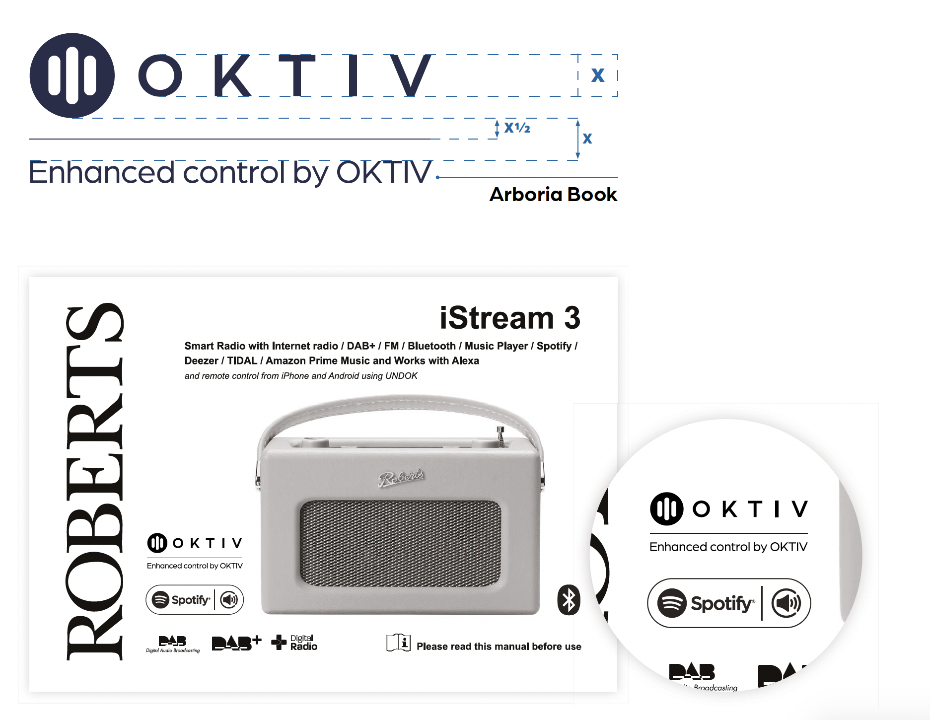
Tagline:
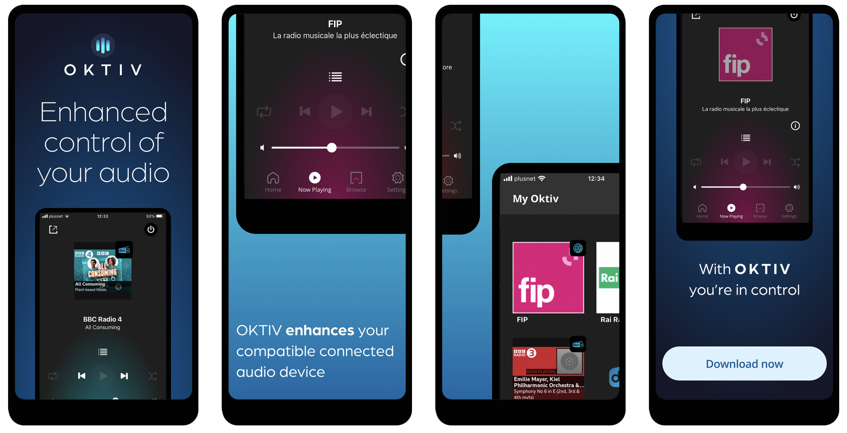
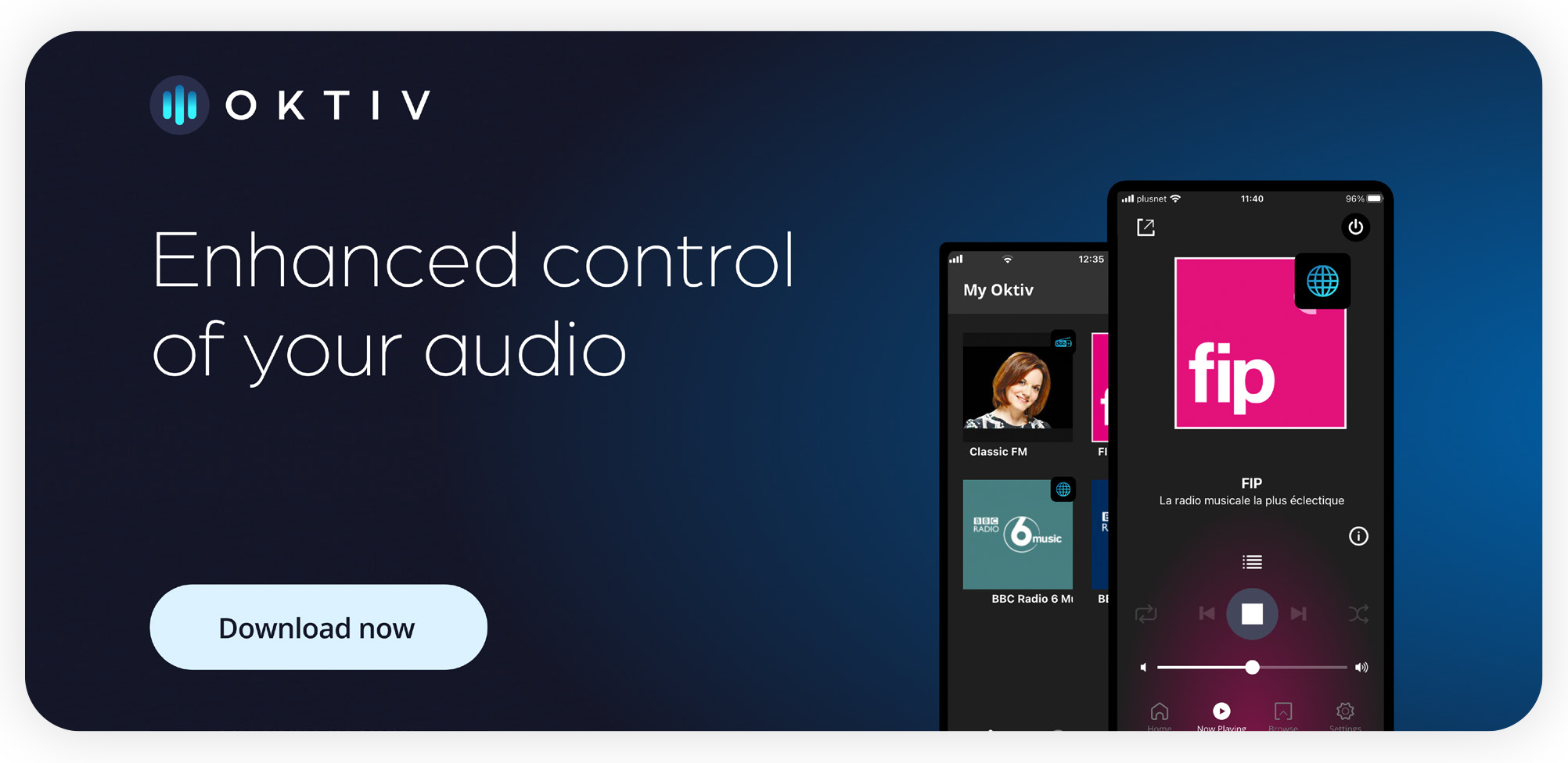
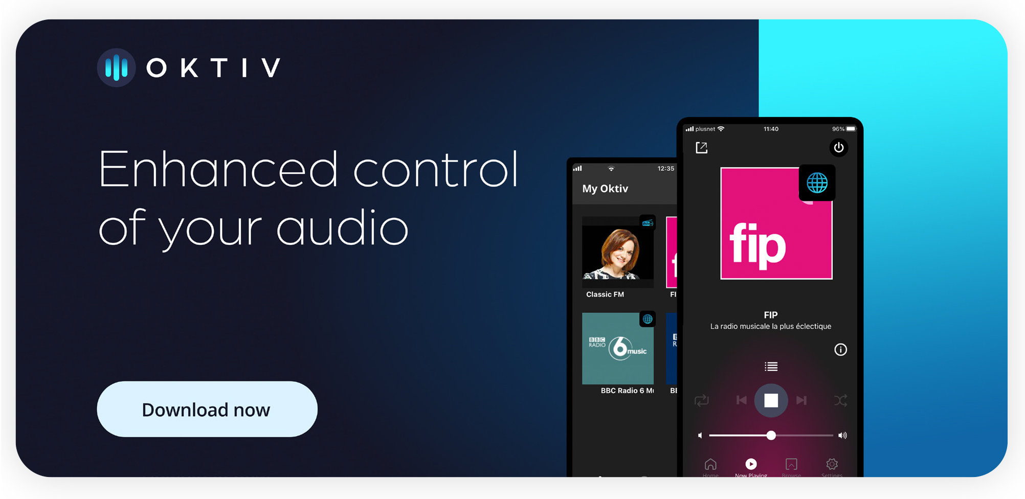
Enhanced control of your audio 

Short product description:
OKTIV enhances your compatible connected audio device – giving you more control and a better listening experience. 

Long product description:
OKTIV enhances your compatible connected audio device – giving you more control and a better listening experience.

The companion app connects to your device using your WiFi network. As long as you are connected to the same WiFi network you can control your connected audio device from anywhere in your home. 

Pin your favourite audio content (podcasts, radio stations and on-demand audio) to the ‘My Audio’ section of the app homescreen for quick and easy access. Use the app to select the audio source you want to play, discover new audio, change the volume and audio settings, and turn your connected audio device on or off. With customisable presets available for each source, you can quickly select a different station or song without having to search for it. 

Supported audio sources include Radio (Internet Radio, DAB, FM Radio), On-demand services (Spotify Connect, Amazon Music, Deezer, Tidal, Qobuz, Napster, Podcasts) and Input (Line Input, Bluetooth, USB). The sources available in OKTIV depend on the functionality of your connected audio device. 

OKTIV is compatible with connected audio devices running [software version x and above], check your device for more info. 

With OKTIV, you’re in control. 

Brand Guardian
James Taylor Email James Taylor

Partner messaging

Partner contextualising tagline

O K T I V COMPAT I B L E :
Enhanced control by OKTIV 

Upgrade messaging 

OKTIV is compatible with connected audio devices running [software version x and above], check your device for more info. 

Partner product description 

The OKTIV companion app enhances the capabilities of your connected audio device by allowing you to connect and control your device over WiFi.  

Colour palette

Our primary colours are dark blue and light grey, complimented by a vibrant secondary palette to help establish hierarchies of importance, highlight primary elements and create interest in any design composition.

Primary Colour

42 46 75 R 42 G 46 B 75 #2A2E4B C 91 M 81 Y 41 K 42
247 246 245 R 247 G 246 B 245 #F7F6F5 C 4 M 3 Y 4 K 0

Secondary Colour

53 243 255 R 53 G 243 B 255 #35F3FF C 56 M 0 Y 12 K 0
16 102 166 R 16 G 102 B 166 #1066A6 C 90 M 55 Y 9 K 1
219 240 253 R 219 G 240 B 253 #DBF0FD C 17 M 0 Y 0 K 0
89 91 113 R 89 G 91 B 113 #595B71 C 68 M 58 Y 36 K 23
0 0 0 R 0 G 0 B 0 #000 C 91 M 79 Y 62 K 97
21 23 41 R 21 G 23 B 41 #151729 C 97 M 87 Y 50 K 70
117 117 117 R 117 G 117 B 117 #757575 C 52 M 42 Y 41 K 25
FFFFFF R 255 G 255 B 255 #FFF C 0 M 0 Y 0 K 0

Colour blend

Fonts

Primary 

Our primary typeface is Arboria. This should be used for headers and sub-headers.

Primary 

Our secondary typeface is Open Sans. This should be used in body text and content blocks.

Iconography

Iconset 

Our iconset is designed to be highly functional and accessible. When designing a new icon a criteria must be kept in mind and each icon should: 

  • Aid comprehension and scanning speed 
  • Communicate the concept through a simple representation 
  • Emulate our keyline icon style 

App icon 

Our icon is designed to be easily recognisable at any given size required. This is achieved through its simple shapes and high-catching colour system.

Visual language 


Print works examples

Our visual language is modern, sophisticated and young. Our design compositions always strive for simplicity and minimalism allowing for a fair amount of white space around design elements. 

Our communications are designed to be subtle and not too loud. The dark blue background dominates and establishes mistery, modernism and professionalism complimented by the usage of light typography and light blue gradient. 

When needing to create high interest or engagement, our cyan to light blue gradient can be employed along with white text and dark mock-ups showcasing the best of our app.