Logotype

Logotype
This is the primary logotype for OTM and should always be used where possible.
Reverse Logotype
This logotype should be used when the primary logotype cannot, for example on dark colours and imagery.
Mono Logotype
The only time the logo appears black is when the print requirement is mono. For example a fax, or 1-colour black printed documents.
Clearance
To ensure its integrity and visibility, the logo must always be kept clear of competing text, images and graphics. It must be surrounded by clear space, a space equal to the height of the ‘o’ in the logo. The measurement of the OTM logo is specified by the cap height of the ‘o’. As a good principle business logos should always be positioned top left on any media.
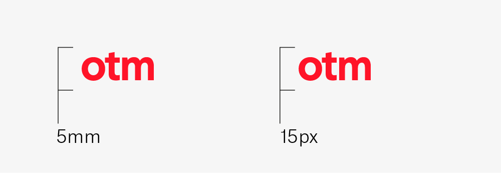
Minimum size
The minimum size for the logo is 5mm cap height for print and 15 pixels cap height on screen.
With science group descriptor
This is how the logotype should appear when used with the ‘a science group company’ descriptor. The descriptor can sit ‘half of the cap height’ away from the logotype. Please use judgement when using this lock-up.