Colour palette
The SmartRadio colour palette depends on contrast and simplicity to reflect a high level of professionalism and expertise.
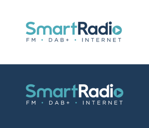
Examples of the logo with the colour palette. The primary Light version and the alternative Dark version.
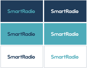
The logo colour is flexible within the SmartRadio brand colour palette, but clarity is always maintained by the use of contrasting colours. The following examples showcase the ways the colours can be used.
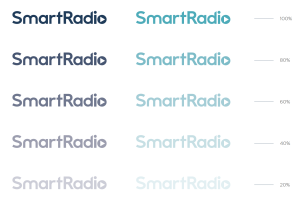
Tints can be used within the brand as a dynamic way to create tonal differentiation. This can be used for backgrounds, overlays, typography and graphics.
The tints in the illustration are shown in percentages of their original colour.