In use
Layout notes
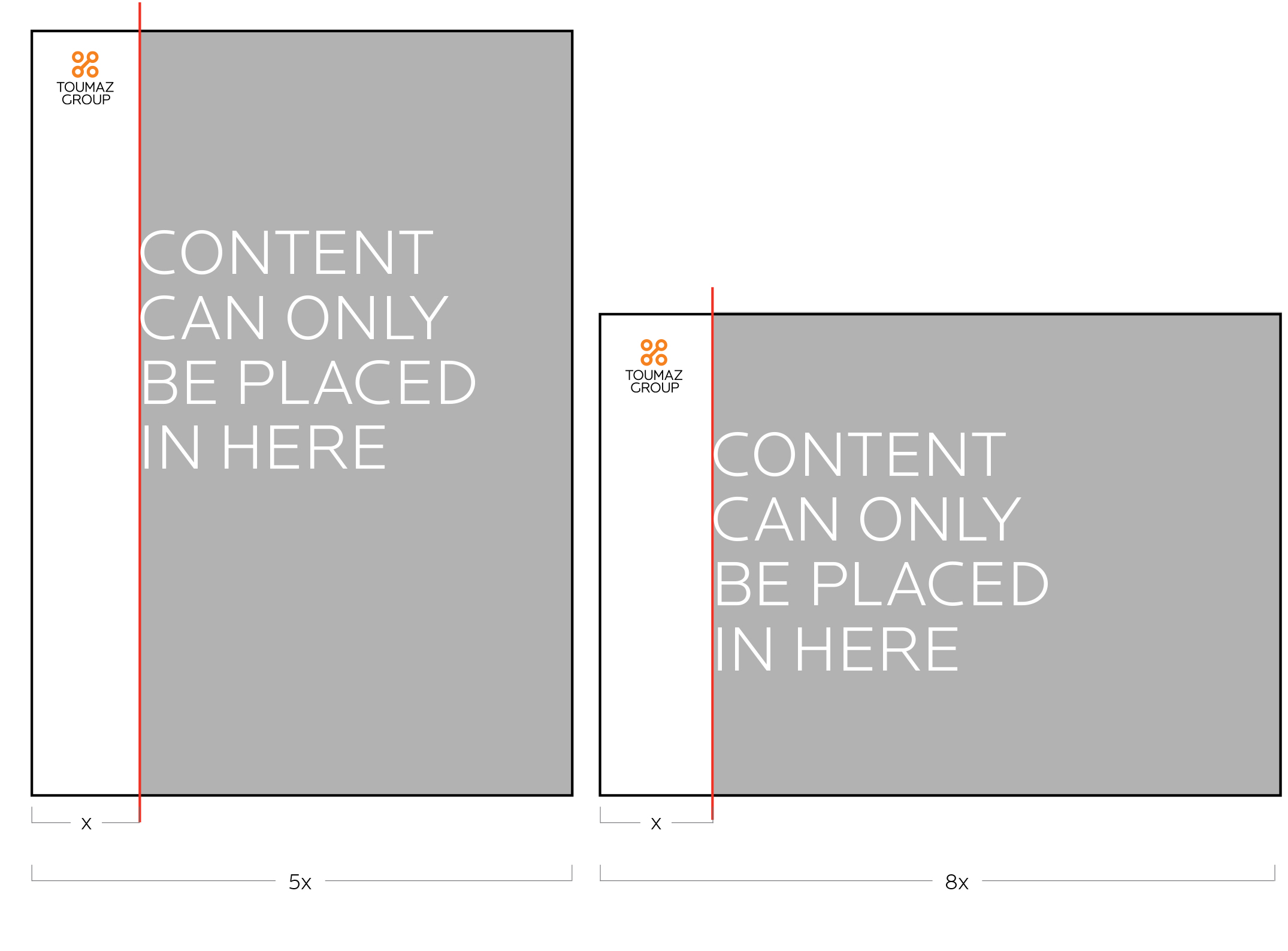
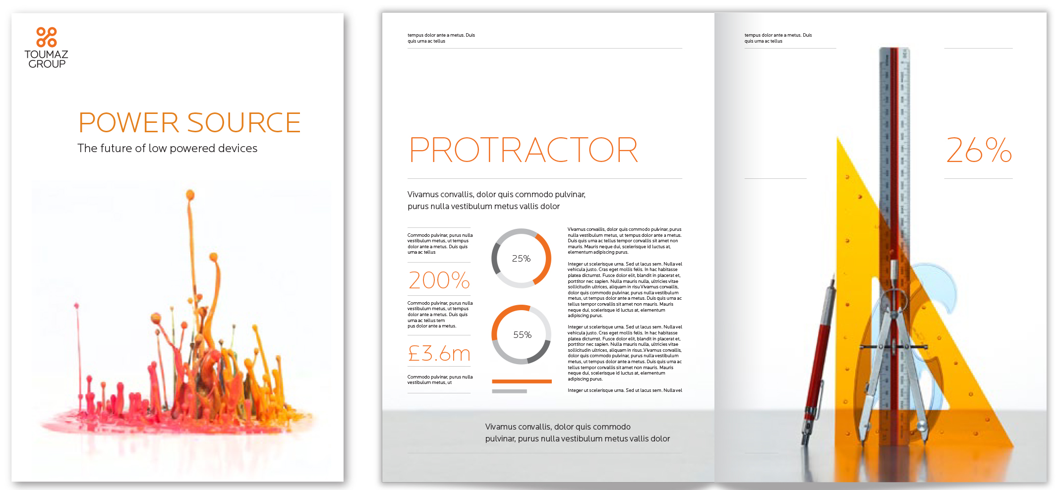
Our layouts use a strong grid to show our precise nature.
In addition we use thin horizontal lines that provide structure and divide our content, when possible we leave a free column on the left of our layouts.
Our logo and some small details on the document can be placed in the column, but headlines, images and body copy should not be placed within the left hand column.
As a general rule on verticle applications we allow 1/5 of the width to be reserved as a column. On horizontal applications we use 1/8 of the width for the column.
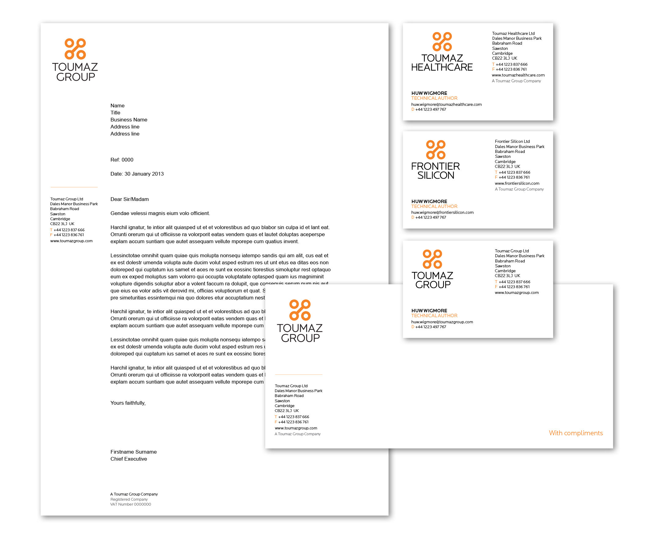
Stationery
For any stationery requirements please contact our marketing department at: marketing@toumazgroup.com
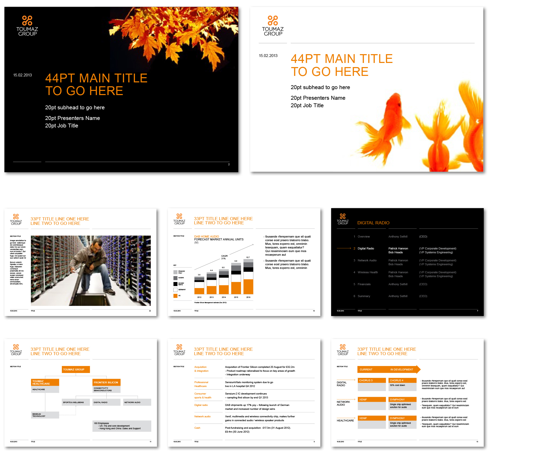
PowerPoint
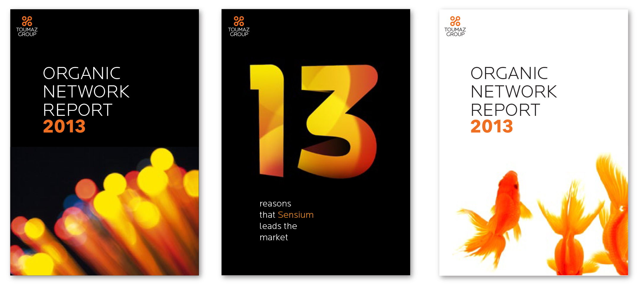
Our PowerPoint uses black for divider and cover pages to add pace and contrast to presentations.
Covers
Our PowerPoint uses black for divider and cover pages to add pace and contrast to presentations.
Animation example
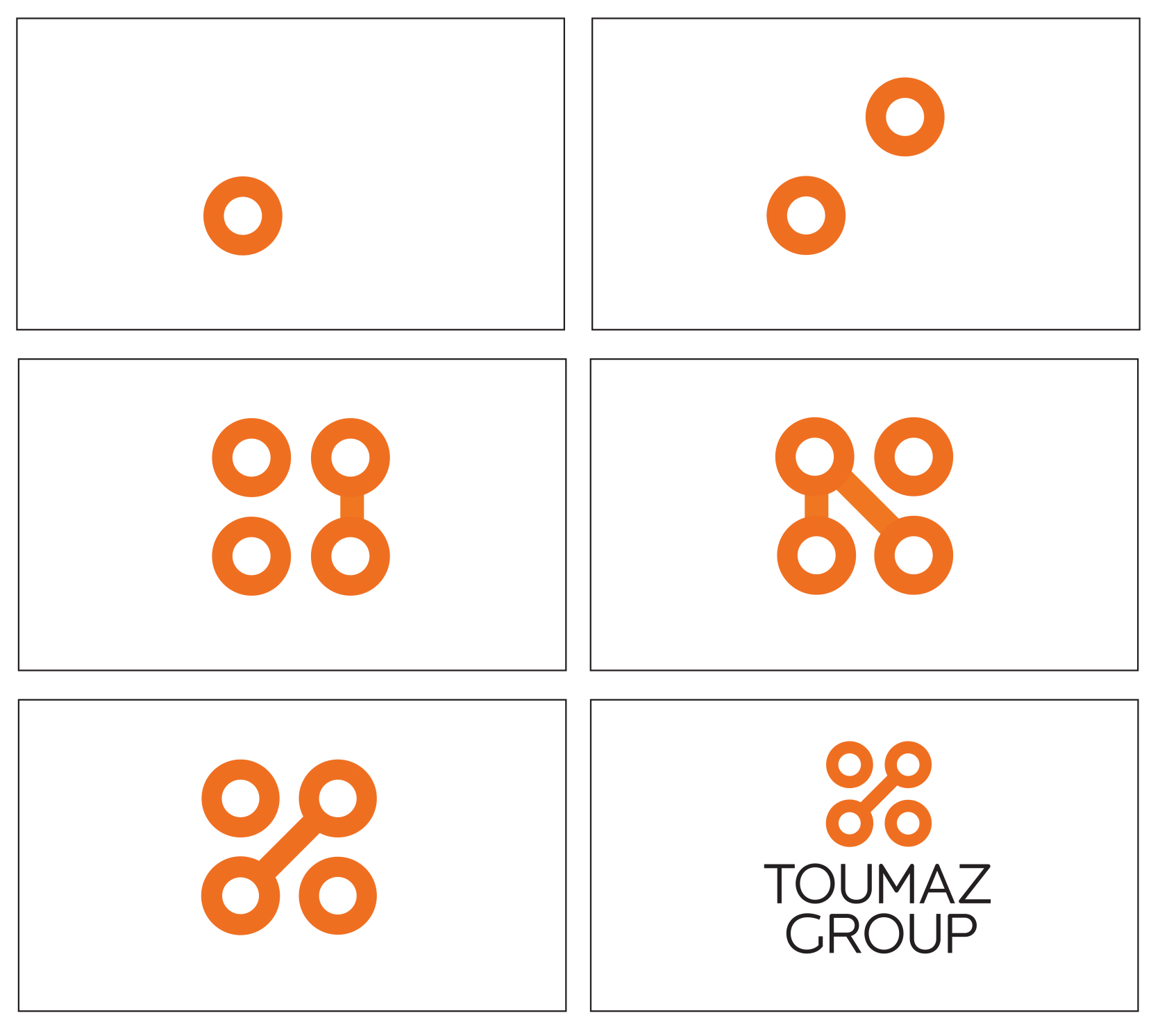
Our logo signifies connections, both on a human and electronic level. In animation it can be connected in a number of ways as long as it resolves the animation in the form used in our logo.
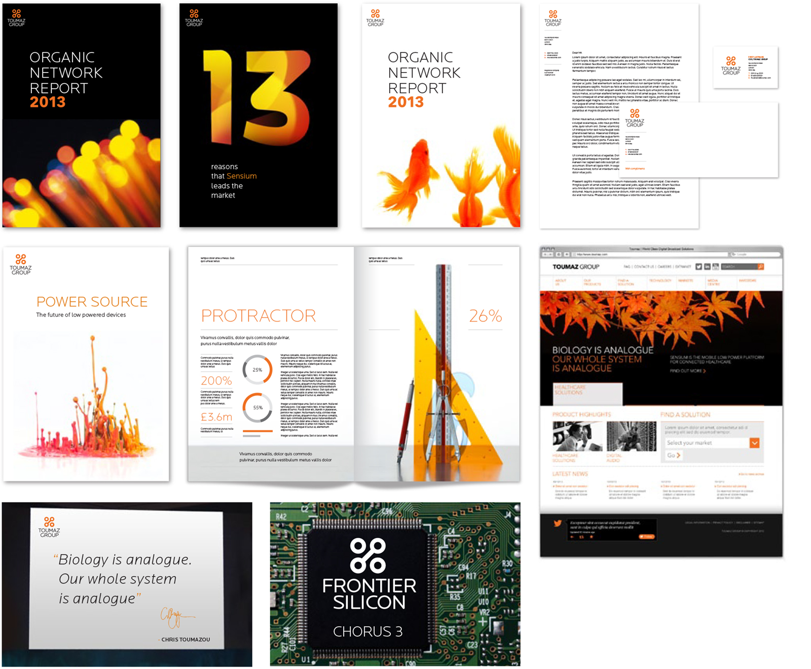
Sample Galleries