Our vision

Our vision is to be the company that customers rely upon to solve their most testing challenges, to create solutions and to manage their most valued assets.

Our mission

We work in areas related to national security and energy supply that are critical to a safe and prosperous society. We provide services and equipment when critical systems are needed to assure public and industry security and wellbeing.

Brand Guardian
Sue Winfield Email Sue Winfield

Tone of voice

Our core values

We are trusted by our Customers and Partners to deliver reliable and confident solutions.We are known for delivering innovative thought and critical technology, providing customer solutions and solving their challenges.

We are bold and reliable in our approach and proud of our achievements. 

These values underpin our behaviours and beliefs, enabling our people to deliver outstanding performance proudly. It’s not just about the projects we deliver but how we deliver them.

These values are a way of life for everyone at tpgroup. They are the bond that joins us together and the reason our customers will choose us to deliver for them.

TEAM / tpgroup-our six core values:

Achieve together – thrive on knowledge sharing, help each other and deliver projects as one team.

Embrace responsibility – take responsibility for our own work. Trust our people to deliver their projects and have ownership in what they do.

Strive for excellence – constantly strive to achieve the highest standards in our work.

Build unity – work cohesively with our colleagues, partners and customers to build strong and lasting relationships.

Challenge ourselves – challenge ourselves and our people to develop and grow. To learn new things and always seek to improve what we do.

Have integrity in all that we do – always conduct our business fairly, with honesty and transparency.

Photography

Photography should be engaging. This can be achieved through composition and depth of field.

Imagery must take the requirement for the inclusion of messaging into consideration by having clear space to accommodate copy.

Images should be of a good quality and have the correct resolution for their usage.


Sample Galleries

Typography

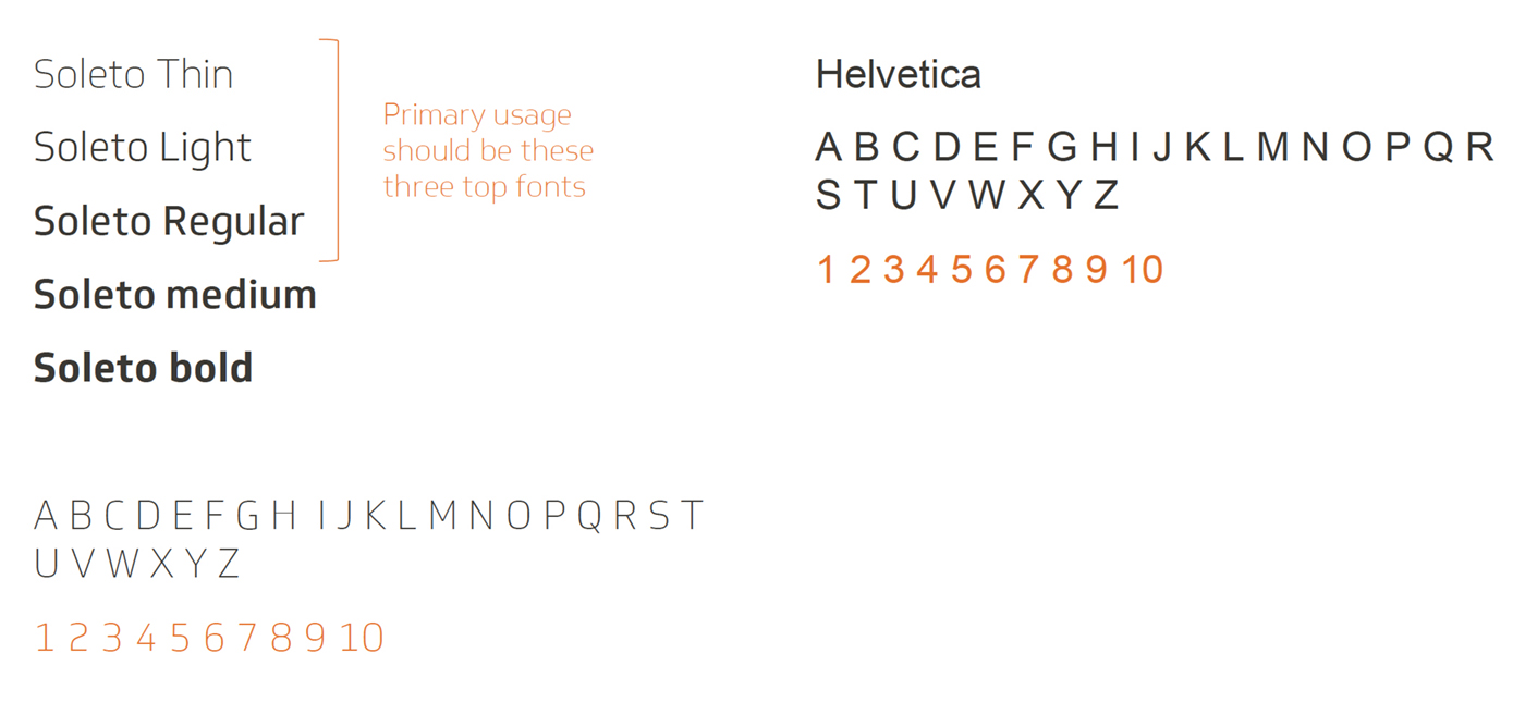
Our primary typeface is called Soleto. Particular usage of Soleto Light, Thin and regular variations should be used across all material and media. 

Soleto medium and bold can be used to differentiate heading levels within long bodies of text.

Our alternative typeface is Helvetica, which is only used when Soleto is unavailable or not a potential option. 

typo

Colour palette

Our marketing material works around three primary colours. The orange and dark grey colours are primarily used, with the light grey being used to accent and provide an additional element.

We also have secondary colours used for diagrams and charts in support of our primary colour palette.

Colours may appear differently depending on which colour space you’re using (CMYK or RGB)

IMPORTANT; Colours may appear differently if you are designing something for commercial print using the CMYK colour codes. Please ensure you refer to the RGB colour codes in this case to avoid an ‘Out of gamut’ error. 

Colours

Orange R 229 G 114 B 0 #E57200 C 0 M 50 Y 100 K 10
Black R 61 G 57 B 53 #3D3935 C 0 M 7 Y 13 K 76
Grey R 237 G 239 B 241 #EDEFF1 C 2 M 1 Y 0 K 5
Green R 144 G 238 B 30 #90EE1E C 39 M 0 Y 87 K 7
Yellow R 240 G 255 B 97 #FOFF61 C 6 M 0 Y 62 K 0
Blue R 145 G 243 B 243 #91F3F3 C 40 M 0 Y 0 K 5

Line angles

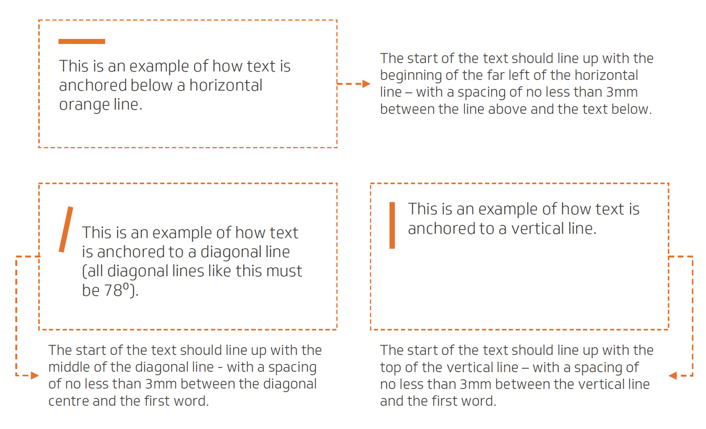
We use orange lines (sometimes the dark grey and light grey) to separate images, headings and copy from one another.

We also use lines to allow us to anchor small text –so it doesn’t look like it’s floating on a page.

If a diagonal line is used, then it must be at an angle of 78. 

All orange lines can vary in stroke size depending on layout and design, but a general starting point would be 2 or 3mm thick –then adjust accordingly.

Lines should be a minimum length of 5mm and a maximum of 25mm.

TP_lines

Iconography

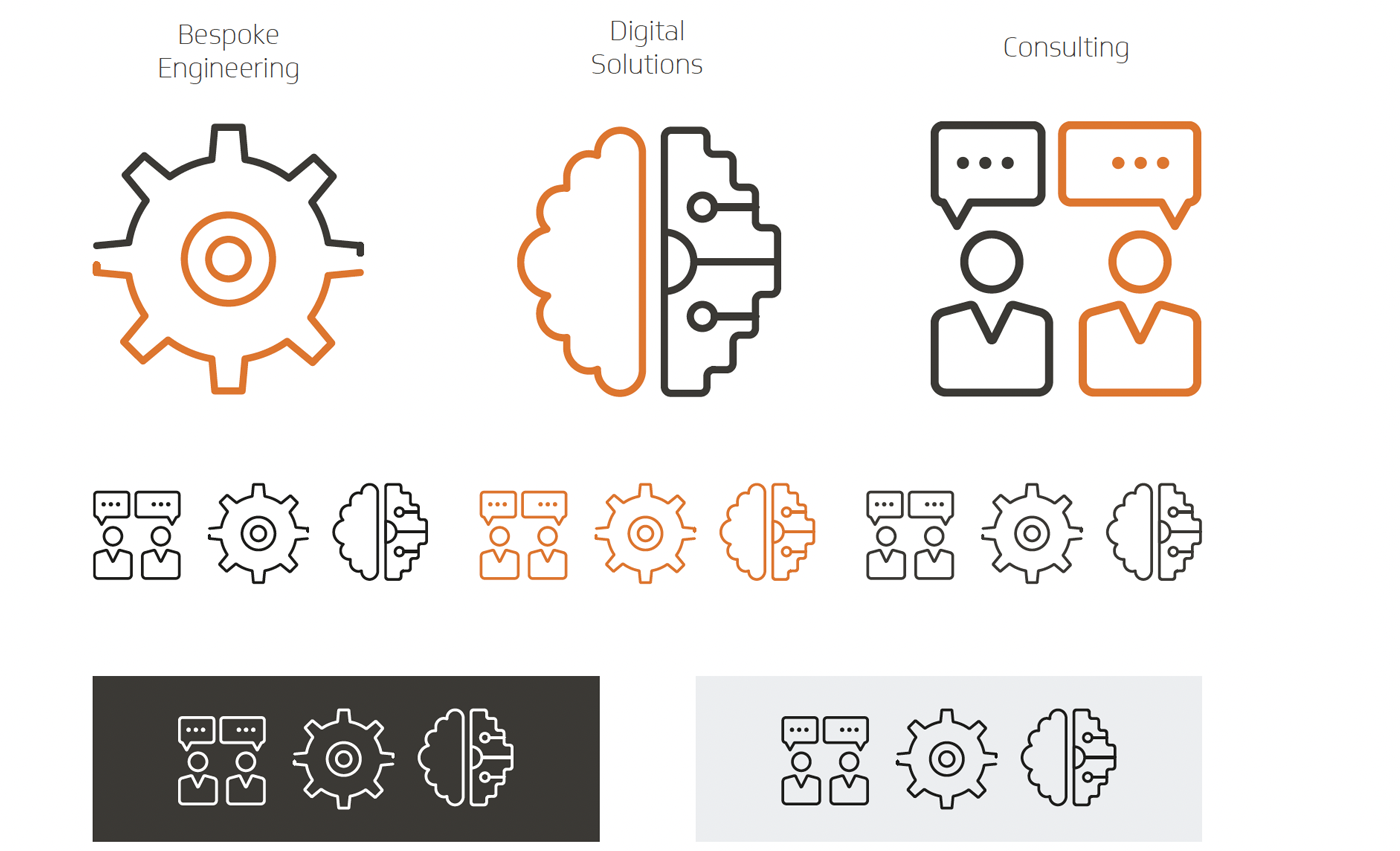
Iconography should be simple and clear at what it’s trying to convey. 

Icons should use the brand colours of orange and dark grey, with some instances using both colours to create a contrast.

Standard black icons can also be used as well as white icons to fit against a contrasting background.

TP_icon

Videography

Videography should be engaging. This can be achieved through composition, lighting and sound.

Footage must take into consideration the tone of voice and messaging that the narrative is trying to convey.

Video resolution should also be of high quality and meet the desired requirements. 

TP_video

Templates

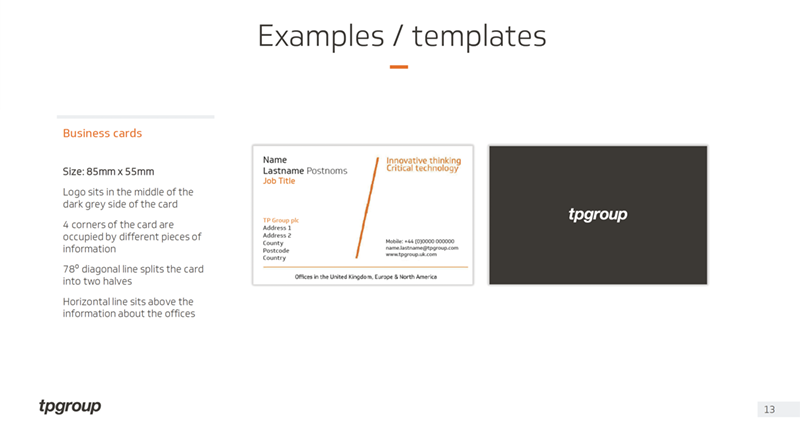
Download the TP template pdf for further information

TP_templates

template